Monday, June 4, 2012

A Day in the Life of Terry Richardson

 Non-natural Lighting (Lots of flash)


Natural Lighting (little or no flash):


"Some people look at a picture, and if there's some energy and there's some sexiness or something they like about it, it appeals to them... it's an energy people respond to... And I think that's more on a human level." 1 Born on August 14, 1965, in New York City, Terry Richardson became a son to Bob Richardson, a fashion photographer who struggled with schizophrenia and drug abuse. Terry was shy as a teenager and at times deemed "completely lacking in social skills". What he did not know, was that he was soon to become one of the largest fashion and celebrity photographers of the 21st generation, as well as an extremely weird, perverted, yet genius and creative individual.  Terry is able to capture the truth behind the person; the raw, candid,real emotions and self of every human he photographs through different types of lighting, simple background and a few props, and rare/raw moments.

Lighting definitely comes into play when illuminating specific emotions in his photographs. In Terry's "extreme flash" photographs, Terry captures every detail and imperfection of his subject, creating a sense of rawness and free-spirit. Terry's photographs almost shine and have a glossiness and crispness to them, that could make almost any picture marketable. In Terry's more toned-down lighting photographs, there is a more relaxed, softness through his models. Although there is less brightness and spunkiness in his "non-flash" photographs, he still emulates a side of his models/subjects that he wants to portray. Terry's bright lighting adds an extra spunk and "pazazz" representing the playful and child-like side to his models, while his dimmer lighting adds more softness breaking through the inner-core to the raw, real emotions of his subjects.

Along with the lighting illuminating his models "core", Terry uses simple backgrounds and few props when photographing his subjects. Again, by using only simple elements, Terry is able to keep the focus on his subject and not other elements such as props or lighting, or scenery (Terry usually photographs subjects with huge personalities anyways; he will not photograph them if he finds them boring). "I know there's the whole thing of putting objects in this really rich, expensive, fancy looking setting, or lighting or whatever, but I think stuff like that, unless it's done really well, just looks old fashion and kind of boring, you know?" 1 By keeping things more "real" and using props you would see in your every-day life (not a snake wrapped around his models neck, or lion roaring in the background), his photographs become more personal, and relate able to the viewer.

Terry also has the natural capability to find the rare and raw moments of his subjects. Under the constant lime-light of the celebrity world, Terry discusses how people made fun of him for only having a simple point and shoot camera, questioning, "Where is all your equipment?". In Terry's defense, he does not need complicated and high-technology equipment to get the shot he wants. He has the ability to use whatever is given to him and create a masterpiece. By using music and just "hanging out" as the objective with his subjects, Terry gets his models to loosen up and express themselves. As well, due to Terry's nerdy and some-what pedophile looks, most of his models do not find him intimidating and feel comfortable enough to shred their outter layers and give him their inner self in front of the camera. 

Overall, Terry creates an inspiration to all first-time photographers; with just a simple understanding of lighting and how it portrays a specific emotion or story, understanding the use of simplicity, and being able to dig deep into those "rare" moments, anyone can be just as provocative and suggestive as Terry Richardson. 

1 Terry Richardson, "Terry Richardson on the Snapshot", http://www.youtube.com/watch?v=YzysNP48xLk


For my interpretation of Terry's work, I wanted to incorporate the natural lighting he uses, yet have the sharp and funky personality of his models in his non-natural lighting pictures. Here in the above pictures, Jill is in natural lighting (one of Terry's lighting methods), and still presents her personality in a sassy and almost provocative style in which Terry exemplifies in his "lots of flash" pictures. I couldn't just take one really good photograph, as Terry usually photographs/posts a series of pictures of his models. I wanted to incorporate more of Terry's "provocative" element to his photography, but I had to keep in mind that this is for a high school project... So keeping it on the PG side was sort of important. 


(Btw, sorry for all the examples of his pictures... there's just too many to choose from. Take a look for yourself on Terry's tumblr/blog/main website/portfolio/. You'll see what I mean by his provocative element... there's a lot of nudity. (He has a real website, but it's just boring and doesn't display the goods.


(All photos of Jill were taken with a Nikon 3100, with a 35-55mm lens. The first picture has an aperture of f/4.2 and a shutter speed of 1/250. The second picture has an aperture of f/4.2 and a shutter speed of 1/500. The third picture has an aperture of f/4.5 and a shutter speed of 1/80.)

Tuesday, May 22, 2012

"As you grow older, you will discover that you have two hands, one for helping yourself, the other for helping others" ~Audrey Hepburn


For my last alternative process, I made a cyanotype. I used an image of Elizabeth's hands and cut around them to only have the blue from the cyanotype show through (as you can see, cutting around the fingers was a struggle, so I decided to leave that alone to show some grain of the original image (also, I did not want to risk the picture by painting on more chemicals and possibly messing up the whole thing)). I basically wanted to portray the story that hands give. Every human's set of hands have a story to it; a struggle; an adventure; a masterpiece. Here, Elizabeth's hands tell her story through her many pieces of jewelry, overall representing her creativity and individualism.


(The original picture was taken with an aperture of f/5.6, a shutter speed of 1/60 seconds, with a 18-55mm lens, with a Nikon D90.) 

Sunday, May 6, 2012

The Rules Are Meant to Be Broken


Breaking the rules was actually not as easy as I imagined it to be... Constantly hearing: "Make sure to line up your subject according to the Rule of Thirds"; "It needs to be balanced"; "Use your light meter", by photo teachers, breaking out of the norm was quite difficult. This project made me feel uneasy and unsure of many photographs as I found it difficult to break the rules of photography yet still create an interesting and creative photo. Most of the time, I ended up bending my arms in funny directions to get the camera on an interesting angle (picture 1 and 2). But, I realized that didn't always work... I then decided to play with lighting and not being afraid of using limited amounts of light (picture 1). I also realized I could manipulate the background to make a main focus on the subject (picture 3-motion blur around Pugsley). All these photographs have broken the rules of photography in their own unique ways. May that be, the rule of thirds, or framing, or simplicity; they all have their own individuality as they are not set  to be in any specific boundaries. 

(The first picture was taken with an aperture of f/3.5 and a shutter speed of 1/15 seconds. The second picture was taken with an aperture of f/10 and a shutter speed of 1/250 seconds. The third picture was taken with an aperture of f/4 and a shutter speed of 1/60 seconds. All photos were taken with a 18-55mm lens with a Nikon D90.)

Thursday, May 3, 2012

Escape


For my second alternative process, I chose to make a rayograph. I wanted to portray the escape of creativity and originality. In our society, we are so isolated and imprisoned in being a specific stereotype. My image I created shows the escape of the mold we are under. I believe we all have our own unique qualities and creativity, and we shouldn't be afraid to let go and show who we really are. 


To create this image, I used 4 clear plastic shot glasses, tiny plastic cubes, sparkles, and small beads. I laid the plastic shot glasses on their side with the plastic cubes weighing down the cups so they wouldn't roll around. I then laid out the sparkles, cubes, and beads around the only tipped cup to show the "explosion" of creativity and expression. 


(Ps, the scanner took away some of the details of the cups and ice cubes.. ugh)


(For this image, I used an aperture of f/8 and exposed the image for 20 seconds.)


Tuesday, May 1, 2012

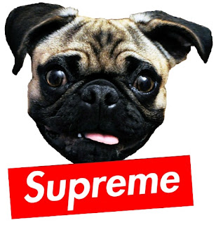
Supreme Pug


The Original


The Print


For my first alternative process, I decided to make a silk screen image. I wanted to incorporate two of my favourite elements; fashion and my dog, Pugsley. I decided to re-create a "Supreme" logo with my dog's face. "Supreme" clothing has been worn by famous celebrities such as Lady GagaKate Moss, and of course, Tyler the Creator. I tried to find a hat similar to the designs of "Supreme"'s, without blowing my budget (Supreme hats usually cost $40-50). I tried to find a hat that was similar to the design of these and thesehowever, I found out snap backs and baseball hats are quite expensive. I went to a dollar store to find snap backs, but I realized the quality of them were far from good. I decided I would have to make a small investment to get a good quality snap back. I went to the "New Area" hat store in Toronto. I found a plain white and black lid, snap back. 


The process of silk screening the actual image on the hat was a huge struggle. After washing the hat in the dishwasher, and numerous attempts at scrubbing away old mistakes, I realized I shouldn't have put the paint directly onto the hat. I ended up silk screening the image onto a t-shirt, cut out the patch, and fabric glued the image onto the hat (covering old mistakes). It turned out super cool this way. The print was raised on the hat, with the "Supreme" popping out the most. I like the way this looks, as it actually looks like it was manufactured with patch work by a company. If I wanted to, I think I could make a whole line of Pugsley and "Supreme" clothing!

(For the image of Pugsley, the aperture was f/5.3, a shutter speed of 1/13 seconds, a 18-55mm lens, with a Nikon D90.)